
María José Téllez – Senior Product, Service Designer, Digital Ethics & ACC Coach
Expert in active listening, analytical observation, and effective communication. Specialised in designing and implementing innovative solutions with humanity-centered approach (people, planet, profit), combining empathy and creativity to achieve exceptional results.
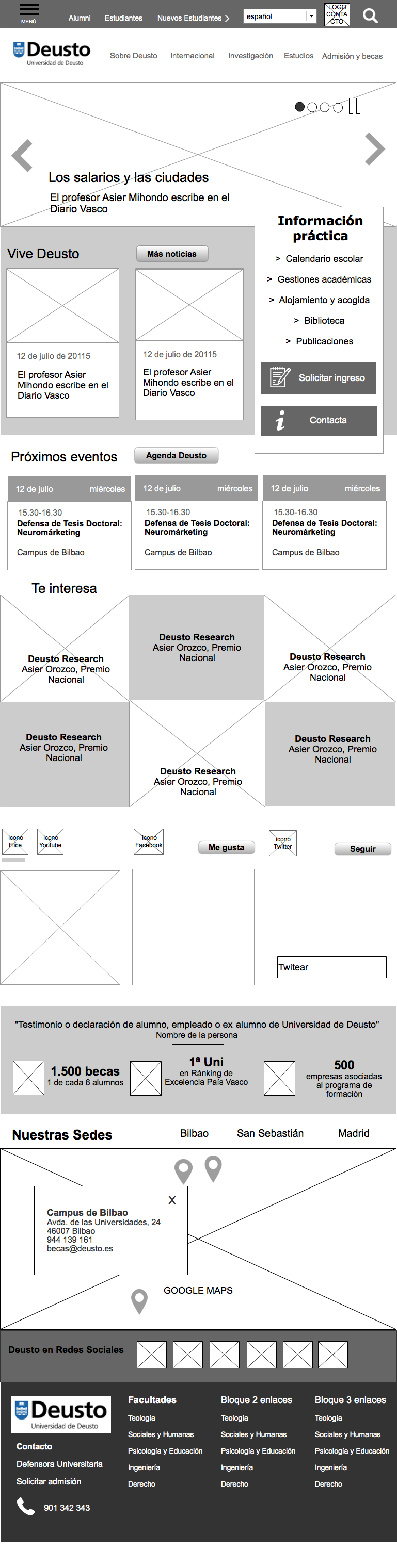
More than retrofitting: Interaction Design for Universiad de Deusto Responsive Site
The client had a premise: “We wanna see our place on mobile without touch the information architecture.”
“Oh, but that sound impossible. Its mandatory to think on mobile first and… what the hell are those of dozen of duplicated pages, widow and orphan pages. I can´t see the deep of the web” – I answered.
“Well, -responded the project manager- “you has 23 sessions to arrange it with recommendations and improvements, but without change the content and we´ll expect 25 templates. Make only interaction design….”
That kind of crazy projects shows the ignorance about responsive web design, but the worst, the absolute ignorance about information architecture as the pillar of whatever project.
First of all, I try to do a rapid navigational tree and I found six level of navigation… Wow. After hours of thinking in a convenient proposal, we discard the hamburger both desktop and mobile, we decided to prototype only for 468 px and 1.280 px and work hard in the navigational system to make robust the solution instead thinking only in templates without the integration of all the subjects.
The home shows the global navigation in horizontal with a layer on mouse over in desktop, click on tablet y hamburger at the right side on smartphones. When the user go to a mini site or a place with independence, the main navigation reduce the space, but live together with the own navigation of the place. The scroll down shows a new bar always fixed on top in wich logo is minimal and user always see where he is and from where come.
Hamburger works right with the accordion effect: you open a menu and them the previous options folds with all his children. The menu shows when its opened, the options of the mini site in where you are, instead all the items from the beginning.
That kind of solutions are a integrative solution, and umbrella solution to keep all the pages inside referenced place: Universidad de Deusto.
Then we have applied another improvements than makes easier to find information: avoid to much distributive pages, highlight the content than students expect at first place, give visibility and hierarchy consistently, labeling incomprehensible options, adaptive tables, submenu on smartphone to show the sections…
So, if you are familiar with information architecture matters, you could see that at the end I worked on it… and how the reason and the heart guided, we reduce the templates and prototyped master pages and components in order to facilitate the project times, content findability and shows the best navigation and best experience possible mobile first.

 María José Téllez - Senior Product, Service Designer, Digital Ethics & ACC Coach